Creating a compelling resume is an essential step in the job application process. However, numerous factors influence its effectiveness, one critical aspect being font size. The font size you choose significantly impacts readability and, consequently, the likelihood of capturing a potential employer’s attention. Therefore, it is paramount to consider what font size is optimal for resumes to ensure clarity and professionalism.
Understanding the Importance of Font Size
In the realm of resumes, font size is not merely a matter of aesthetics; it directly affects how easily information can be consumed. A font that is too small may strain the eyes, leading to frustration and potential oversight of crucial details. Conversely, a font that is too large could waste space and result in a cluttered appearance. Striking the right balance is crucial for facilitating a seamless reading experience for hiring managers.
Standard Font Size Recommendations
Most experts suggest a font size between 10 and 12 points for the body text of a resume. This range generally provides optimal readability while allowing for the inclusion of all relevant information. A size of 12 points is often prevalent, especially for traditional fonts like Times New Roman or Arial, as it strikes a harmonious balance between visibility and space efficiency.
Font Styles Matter Too
The choice of font style plays a pivotal role alongside size. Certain fonts are inherently easier to read than others. For example, sans-serif fonts, such as Calibri, Helvetica, and Arial, are often preferred over serif fonts due to their clean lines. Such selections promote readability and lend an air of modernity to the document. Overall, the chosen font should reflect both professionalism and approachability.
Heading and Subheading Sizes
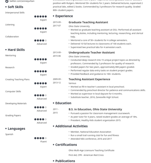
While the body text of a resume should maintain a consistent size, it is advisable to differentiate headings and subheadings for organizational purposes. Headings are typically enlarged to enhance visibility and impact. A size ranging from 14 to 16 points is suitable for headings, creating a clear and structured flow. Subheadings can be slightly smaller than the main headings, around 12 to 14 points, to maintain a hierarchy without compromising readability.
Emerging Trends in Resume Design
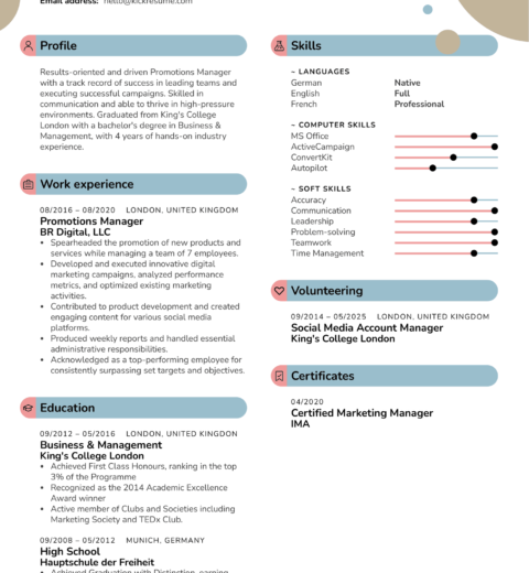
As the job market evolves, so do the conventions of resume design. Modern resumes often adopt creative formats that incorporate innovative elements like infographic sections, visually appealing charts, and varied typography. However, even in these avant-garde designs, maintaining clarity remains paramount. Thus, opting for unconventional but clear fonts within the stated size limits can lend a unique touch without sacrificing professionalism.
The Role of Margins and Spacing
Font size should not exist in isolation. Effective use of margins and spacing complements the text size, contributing to overall readability. Standard margins for resumes typically range from 0.5 to 1 inch, allowing ample white space that reduces clutter. Line spacing of 1.15 to 1.5 is recommended, as it creates an airy feel that enables the reader to navigate the document effortlessly. The combination of optimal font size with appropriate margins and spacing creates an inviting resume structure.
Adapting Font Size for Different Situations
Different scenarios may necessitate adjustments in font size. For instance, if a candidate has a substantial amount of experience and qualifications, they might consider slightly reducing the font size to keep the resume to one page. However, this should never go below 10 points, as readability must remain the foremost priority. On the other hand, for entry-level positions or senior roles where extensive experience is not required, maintaining a font size of around 12 points can enhance clarity.
Consideration for Applicant Tracking Systems (ATS)
In today’s competitive job market, many organizations employ Applicant Tracking Systems (ATS) to streamline the recruitment process. These systems scan resumes, often searching for keywords relevant to the job description. While font size directly impacts visual appeal, it can also affect how ATS interprets the document. Ensuring that the font size is conventional and easy to read can help prevent any misinterpretation by these systems. Fonts such as Arial, Calibri, and Times New Roman are generally safe choices.
Utilizing Personalization
Ultimately, while adhering to general conventions is crucial, integrating a personal touch can differentiate a resume from the competition. Considering the industry and corporate culture where one is applying can influence font size and style choices. For instance, a creative role may permit vibrant designs, while a corporate position may necessitate a more subdued and serious tone. Understanding the desired impression can guide optimal font size and style selection.
Final Thoughts
Choosing the appropriate font size for a resume involves a nuanced understanding of readability, aesthetics, and context. Striking the right balance among font size, style, margins, and spacing can significantly enhance the document’s overall effectiveness. In a world where first impressions hold substantial weight, optimizing font size becomes not just a detail, but a strategic component of crafting a successful resume. Thus, employers are more likely to take notice and appreciate the effort put into creating a coherent and polished presentation.


