Crafting a resume that radiates professionalism and makes a lasting impression is an art. But have you ever pondered how to transform a standard document into a polished masterpiece? The challenge lies not just in the information presented, but how it’s visually articulated. This article delves into the intricacies of designing an exquisite resume in Microsoft Word, ensuring that it stands out while still delivering the essential facts an employer seeks.
First, let us establish the significance of a resume. It is more than a mere document; it is a personal marketing tool. Your resume must succinctly capture your experiences, skills, and aspirations in a format that is aesthetically pleasing. The visual appeal is often the first barrier to break, grabbing the attention of hiring managers amidst a sea of applicants. Thus, how do you strike that perfect balance between style and substance?
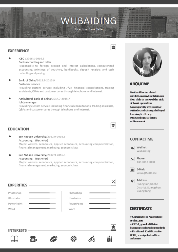
To embark on this journey, one must first select an appropriate template. Microsoft Word provides a plethora of built-in templates designed for diverse professional needs. Navigate to the ‘File’ menu, select ‘New’, and explore the available templates. Look for those categorized under ‘Resumes’ and ‘Cover Letters’. Choose one that aligns not only with your personal taste but also the industry you are targeting—creative fields may welcome bold designs, while corporate sectors might appreciate a more conservative approach.
Once you’ve selected a template, the next step is customization. The first element to consider is color scheme. A cohesive color palette can add a touch of sophistication. Consider employing muted tones such as navy or charcoal contrasted with a subtle accent color. However, bear in mind that clarity should always take precedence over extravagance. The colors should enhance readability, not detract from it. For instance, use darker colors for text and lighter shades for background elements to ensure effortless reading.
Next, font choice plays a pivotal role in ensuring your resume looks polished. Opt for sans-serif fonts such as Arial or Calibri for body text, as they foster legibility. For headings, consider serif fonts like Times New Roman to create an elegant contrast. Avoid using multiple font types which can create visual clutter; instead, limit yourself to two types—one for headings and another for body text—to maintain uniformity throughout the document.
With layout established, it’s critical to consider spacing and alignment. Ample white space, or negative space, is integral to a polished look. It allows the eyes to rest and helps important information stand out. Margins should be uniform, and bullet points must be aligned consistently to guide the reader’s attention smoothly down the page. Using 1-inch margins is a tried-and-true approach, but a slightly narrower margin can be employed if you need more space without compromising on aesthetics.
Content structuring follows next. Within your resume, sections should flow logically, typically beginning with a summary or objective statement. This isn’t merely a formality; a well-crafted summary can convey your career goals and what you bring to the table succinctly. Following this, outline your professional experience in reverse chronological order. Each role should include your title, the company name, and a few bullet points highlighting your key achievements and responsibilities. Use action verbs like “developed,” “implemented,” or “coordinated” to evoke a sense of proactivity.
Equally important is the inclusion of skills and certifications. Consider categorizing skills into soft and hard skills; soft skills such as communication or teamwork complement technical prowess and demonstrate well-roundedness. This not only showcases your capabilities but also presents you as a versatile candidate. Moreover, certifications relevant to your field are an excellent way to exhibit your commitment to professional development.
Now, let’s talk about the visual hierarchy. Employ different font sizes and bolding to set apart section titles from body text. For instance, larger, bolder fonts for section headings can seamlessly guide the reader through your document. However, exercising restraint is essential—overusing bold or italics can detract from professionalism and create visual disarray. Utilizing descending font sizes can create an appealing visual gradient that naturally leads the eye.
Another area of consideration is the use of graphics or icons. While they can enhance visual appeal, judicious use is key. Incorporate subtle elements such as a simple icon next to section titles or in contact information for a modern touch. Avoid cluttering the resume with excessive graphics; the focus should remain on the content.
In this digital age, proofread your masterpiece with diligence. Typos, grammatical errors, and inconsistencies can undermine your credibility. After drafting, take a break and return with fresh eyes, or solicit feedback from trusted peers. Often, another pair of eyes can catch mistakes that the original author might miss. It is a simple yet effective way to refine your resume before submitting it.
Finally, when saving your resume, consider exporting it as a PDF. Ensuring that the formatting remains intact across all devices and platforms is crucial, especially when your polished work is being reviewed by a potential employer. PDFs often preserve fonts and layouts, presenting a professional impression during the submission process.
To conclude, creating a polished resume in Microsoft Word involves an intricate dance between aesthetic appeal and well-structured content. With the right template, thoughtful customization, and meticulous attention to detail, you can craft a document that not only represents your professional journey but also resonates with hiring managers. Now, are you prepared to rise to this challenge and showcase your prowess with a resume that truly stands out?


