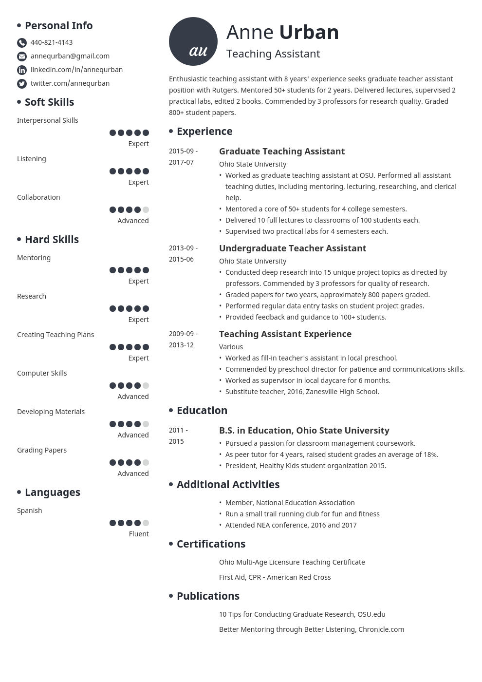
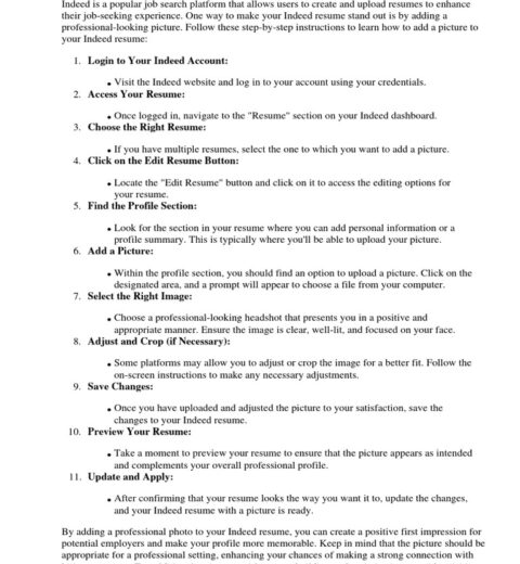
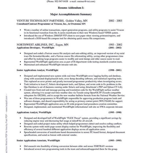
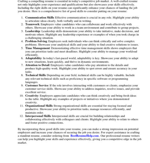
In an ever-evolving job market, the nuances of crafting a standout resume go beyond simply listing your skills and experiences. One fundamental element that can significantly affect the impression your resume creates is the typeface you choose. As we step into 2025, understanding the best resume fonts requires a nuanced perspective. The font you use on your resume not only communicates your professionalism but also subtly influences how your qualifications are perceived by potential employers.
The conventional wisdom surrounding resume fonts has long favored a handful of ubiquitous options: Arial, Times New Roman, and Calibri. However, as the tides of design and professionalism shift, so too must our approach to typography. In 2025, it is imperative to consider fonts that convey both clarity and personality—striking the delicate balance between tradition and modernity.
One important consideration when selecting a font is readability. Recruiters often skim through resumes in search of key qualifications. Therefore, the chosen font must be legible at a glance. Fonts like Helvetica and Georgia have gained prominence not merely for their aesthetic appeal but for their accessibility as well. These typefaces feature clean lines and distinct letterforms, delivering ample contrast whether the document is viewed on a screen or in print.
However, legibility does not preclude the possibility of expressing individuality. As designers and job seekers alike embrace uniqueness in 2025, serif fonts such as Garamond and Baskerville can emerge as compelling choices. These fonts imbue a sense of elegance and sophistication, appealing particularly to industries such as academia, publishing, or the arts where creativity is paramount.
Moreover, the trend toward minimalism suggests that less is often more. Pitfalls exist when opting for overly intricate fonts. Complicated characters may divert attention from your credentials. Hence, while ornate typefaces might be tempting, they can ultimately detract from the very message a resume is intended to convey. Instead, exploring streamlined sans-serif options like Open Sans or Lato can project modernity while prioritizing functionality.
In addition to aesthetics, considering the spacing and sizing of your selected font is a crucial factor that remains often overlooked. In 2025, maintaining appropriate line spacing and font size ensures that your resume appears inviting rather than cluttered. A standard size between 10 and 12 points is typically recommended, with ample white space helping to guide the eye through various sections of the document. When a resume feels organized, the reader is not only more likely to absorb the content but is also more inclined to form a positive impression.
The cultural context in which we operate plays a pivotal role in determining the appropriateness of certain fonts as well. For instance, industries that pride themselves on innovation and creativity, like technology or graphic design, welcome more avant-garde choices. Fonts like Dosis or Raleway bring a refreshing edge, aligning with the ethos of forward-thinking companies. On the other hand, conservative sectors—law, finance, and corporate environments—still favor timeless selections that exude reliability and trust.
Another essential factor to consider is the compatibility of the font with various file formats. As remote and hybrid work cultures solidify their presence, the mode of sharing resumes evolves. This often includes PDF, DOCX, and online submissions. Fonts that do not convert gracefully between formats can result in a distorted presentation of the document, undermining all efforts to craft an appealing impression. Opting for widely available typefaces mitigates this risk and ensures consistency across platforms.
As the importance of brand identity continues to be emphasized in 2025, consider weaving your font choice into your personal brand narrative. The font can serve as an extension of your professional persona; careful selection may reflect your values and personality in profound ways. For instance, using a contemporary font may communicate a tech-savvy mindset, while a classic typeface could reinforce a perception of reliability and tradition. Each choice serves as an unspoken statement about who you are and what you represent.
It is also crucial to be aware of the psychological effects of font choice. Research indicates that different typefaces provoke varied emotional responses. A font that evokes precision and competence—like Verdana—might be advantageous for a data-driven position, while something more inviting, like PT Sans, could resonate well in customer-oriented roles. Understanding the implications of font psychology can be leveraged to enhance the overall impact of your resume—drawing attention not just to your qualifications, but also to the kind of professional you aspire to be.
In summary, as we navigate the complexities of the job market in 2025, the scrutiny of a resume font must not be underestimated. More than mere aesthetics, the typography selected can amplify clarity, convey personality, and ultimately foster connections with potential employers. By carefully balancing readability, individuality, cultural relevance, and psychological resonance, applicants can ensure their selection will not only meet the expectations of the current era but also leave a lasting impression. Choose wisely; your choice in font is fundamental to shaping your professional narrative.


