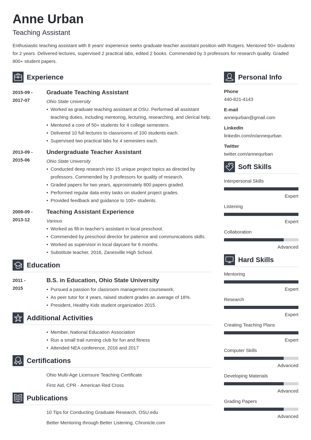
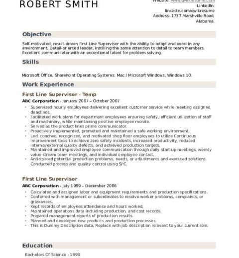
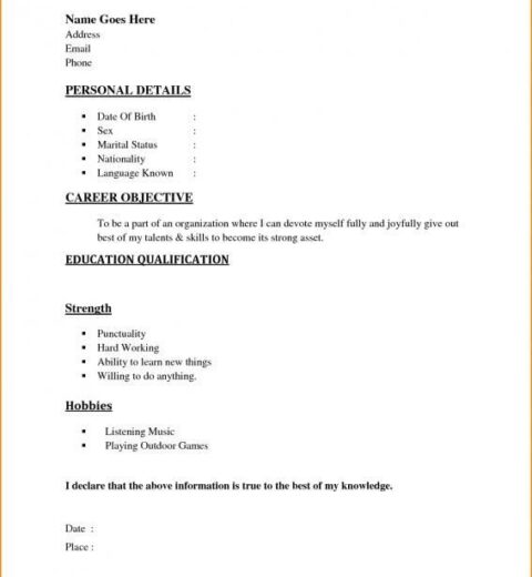
In an increasingly competitive job market, the presentation of your resume can be just as crucial as the content it holds. One of the most overlooked yet significant aspects of crafting an effective resume is the choice of font. Have you ever pondered why some resumes catch the eye, while others fade into obscurity? The answer often resides in typography. The right font can convey professionalism, creativity, and even personality. However, choosing the optimal font is fraught with challenges. Let’s explore the top font selections for 2025, ensuring that your resume stands out for all the right reasons.
Typography serves more than mere aesthetics; it influences readability, tone, and overall impression. In the fast-paced world of recruitment, hiring managers typically spend mere seconds scanning a resume. Hence, fonts that are clear and engaging can significantly sway their first impression. How do you strike the right balance between creativity and professionalism? The following analysis will unravel some practical and stylish font options that can elevate your resume.
To initiate this discussion, let’s categorize the fonts into a few pivotal groups: serif, sans-serif, and display fonts. Each category offers distinct qualities, catering to varying industries and individual styles.
Serif Fonts
Serif fonts are characterized by their decorative strokes at the ends of letters. These fonts are generally perceived as traditional, making them suitable for legal, academic, or corporate environments. The elegance of serif fonts conveys a sense of reliability and stability. A noteworthy example is Georgia. This font strikes an exquisite balance between readability and classic charm. In 2025, Georgia will continue to be a reliable choice, especially for those targeting roles in established sectors.
Another commendable serif option is Garamond. With its rich history dating back to the 16th century, Garamond presents a timeless quality that can make your resume feel refined and sophisticated. Its compact letters allow for maximum content without compromising space, making it a functional choice for applicants with extensive experience.
However, while serif fonts are attractive, they come with a caveat. Overusing them or opting for overly ornate versions can lead to diminished legibility, particularly in digital formats. Thus, striving for simplicity remains vital.
Sans-Serif Fonts
Sans-serif fonts, devoid of embellishments, are often considered modern and straightforward. They exude a clean and contemporary vibe, appealing to creative industries like technology, marketing, and design. For 2025, one of the frontrunners remains Helvetica. With its minimalistic gestures and neutral look, Helvetica allows for an uncluttered presentation of information, ensuring that vital details stand out.
Moreover, the Arial font, often criticized for its ubiquity, remains a viable candidate for resumes. Its simplicity allows for clear communication, and when used wisely, it can project professionalism without appearing too predicable. In creative fields, the challenge lies not in choosing a very common font like Arial but in pairing it deftly with a vibrant color scheme or inventive layout.
For applicants seeking to fuse modernity with a touch of uniqueness, Futura serves as an innovative option in the sans-serif category. Its geometric shapes resonate with a sense of forward-thinking and can appeal to employers seeking candidates who resonate with design-centric roles.
Display Fonts
Display fonts, characterized by their artistic flair, can add inventive dimensions to a resume. However, they should be used sparingly. Exotic display fonts can capture attention but can become overwhelming if employed in excess. When it comes to resumes, the paramount purpose remains clarity.
That being said, a creative person might contemplate using a unique display font within headings to enhance a sense of individuality. Fonts like Bebas Neue can personalize a resume while still retaining legibility. The caveat remains: the essential body text should revert to a more traditional choice, ensuring the following content is easily digestible. Striking this balance is indeed a challenge.
Font Size and Alignment
Once the font is selected, attention must turn to size and alignment. Generally, a font size between 10 and 12 points is optimal for the body text, while headers can be slightly larger to draw attention. Maintaining consistent alignment (left-aligned is often recommended for professionalism) can also play a pivotal role in creating an organized appearance.
In the quest for a standout resume, spacing between letters and lines should not be overlooked. Ample white space can enhance readability and create an elegant flow in the design. It’s not uncommon for applicants to underestimate how sufficient spacing can amplify the overall professionalism of the document.
Conclusion
In conclusion, the selections for resume fonts in 2025 are both nuanced and critical. Understanding the distinct properties of serif, sans-serif, and display fonts allows individuals to craft resumes that captivate hiring managers while effectively communicating their skills and experiences. Choices such as Georgia and Helvetica are timelessly respected, while creative options like Bebas Neue offer a fresh perspective.
The most formidable challenge remains: can you create a harmonious blend of personality and professionalism in your resume? The choice of font is your first step in conquering that challenge, laying the foundation for a resume that commands attention and fosters opportunity.


