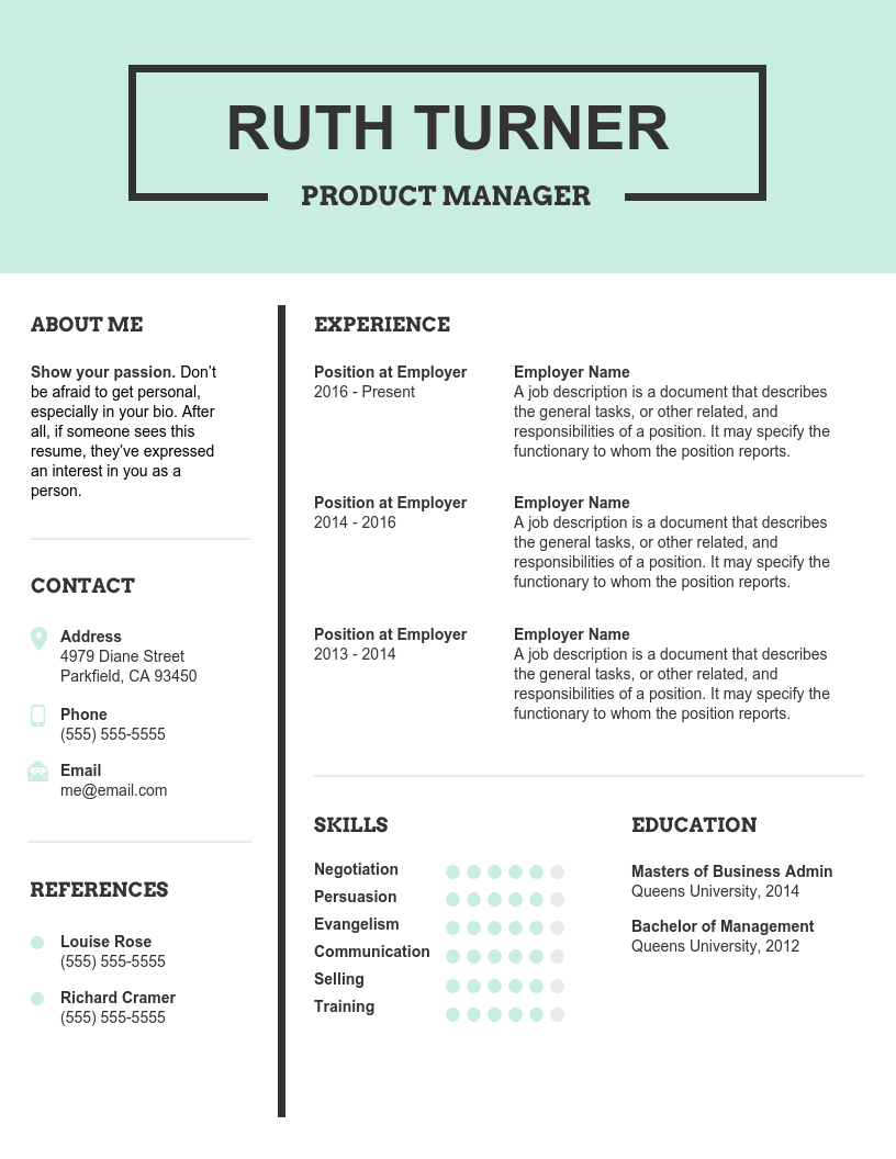
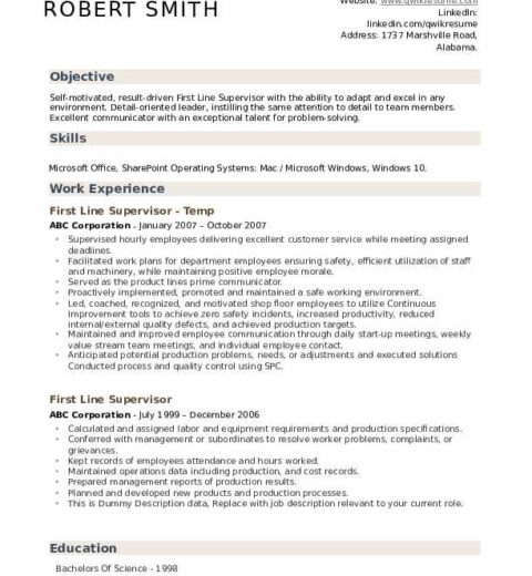
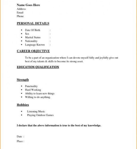
In an ever-evolving job market, the presentation of your resume can spell the difference between landing an interview and perpetually languishing in the void of rejection. The choice of font, often overlooked in the grand tapestry of resume design, plays an indisputable role in shaping the first impression. As we navigate the intricate world of resumes in 2025, understanding the psychological and aesthetic implications of font choice becomes critically important.
First, let’s explore why the font on your resume matters. A carefully selected typeface not only transmits information but also levels an emotive resonance with hiring managers. It conveys your professionalism, attention to detail, and even your personality. Font choices can affect readability, and the way hiring managers perceive your competence. Hence, making an informed decision about typography is paramount.
As we look towards the pinnacle of font options for resumes in 2025, the following categories emerge as the torchbearers of professional presentation: Serif, Sans Serif, and Modern. Each category offers distinct attributes that resonate with different vibes, and understanding these can elevate your resume substantially.
Serif Fonts: Traditional Yet Timeless
Serif fonts, with their striking embellishments, breathe life into your text. They evoke a sense of tradition and reliability. Fonts like Times New Roman and Georgia are classic heavyweights. However, emerging serif fonts like Merriweather and Playfair Display bring freshness to this style, enhancing readability on screens and printed formats alike.
Merriweather, for instance, balances readability with a modern aesthetic. This font is particularly noteworthy for its clarity, especially at smaller sizes, which ensures that every detail of your experience shines through. Meanwhile, Playfair Display exudes elegance, allowing your resume to stand out while maintaining a sense of sophistication. This blend of modernity and tradition can symbolize a well-rounded candidate who respects legacy while innovating for the future.
Sans Serif Fonts: Minimalism Meets Professionalism
On the other side of the spectrum, sans serif fonts are the darlings of a minimalist aesthetic and are favored by professionals who advocate for a clean, straightforward approach. Fonts such as Arial and Helvetica have remained staples; however, 2025 introduces us to modern contenders like Roboto and Open Sans.
Roboto, known for its geometric shapes and friendly demeanor, ensures that your text remains approachable yet professional. Open Sans elevates this further with its neutral yet optimistic tone. The wide letter spacing in these fonts enhances legibility, crucial for those who may quickly scan resumes. Their ubiquitous presence in user interfaces also makes them familiar, contributing to a sense of ease as hiring managers engage with your application.
Modern Fonts: The New Wave
Modern fonts often challenge the conventional wisdom of resume design. They boldly step away from traditional confines, providing candidates with a chance to showcase their creativity and versatility. Fonts like Raleway and Lato emerge here; they balance uniqueness with professionalism effortlessly.
Raleway, with its refined elegance and chic accents, is perfect for industries that celebrate artistry, such as design or marketing. Conversely, Lato strikes a unique balance of formal and friendly, making it suitable for corporate settings. When considering a modern font, ensure it resonates with your personal brand while still adhering to professional standards.
Size and Spacing: The Unsung Heroes
In addition to font type, size and spacing are critical components of typography. A standard font size of 10 to 12 points generally creates a balance between the presence of text and whitespace. However, don’t shy away from adjusting line spacing to enhance readability; 1.15 to 1.5 spacing can create a breezy reading experience, allowing hiring managers to digest the information without feeling overwhelmed.
Branding Through Typography: A Double-Edged Sword
Every font embodies a personality, and thus, strategically aligning your font choice with the job you are targeting can yield advantages. As you consider how potential employers will discern your resume, think of how the attributes of your chosen font align with the company’s culture. A startup may appreciate creativity and playfulness, while a multinational corporation may favor tradition and stability. This alignment is not just a stylistic choice—it can be a compelling part of your brand narrative.
Final Thoughts: The Power of Choice
As we journey through the choices available in 2025, it is evident that font selection is not a trivial detail, but rather a significant element of your professional arsenal. It merits thoughtful consideration, as an apt font can elevate your resume from mundane to memorable. Whether you lean towards the classic gravitas of serifs, the sleek professionalism of sans serifs, or the innovative flair of modern fonts, your typography will communicate far beyond mere words.
In the quest to craft an influential resume, understanding the intricate interplay of fonts can empower you to position yourself as not only a candidate but a compelling storyteller. When hiring managers sift through mountains of applications, the right font can create a foundation for your credentials to shine brightly, ultimately claiming the attention you deserve.


